Form Builder Redesign Concept
High level product redesign concept to evaluate existing UI/UX and investigate future design direction to assist with product roadmapping.
Responsibilities
UX Research
UX Design
UI Design
Context
OpenForms is a drag-and-drop form building and management software aimed specifically at Government organisations from local to federal levels. It aims to make converting paper based forms to digital simple, and allows easy integration into existing government digital channels. The product includes a range of features including a form builder, workflow management, user management, integration management, and form management. The product is usually procured at a senior level within a government organisation, however the day-to-day user tends to be at an administration level.
Understanding the Need
Through observing how users interact with the product, I have noticed that the range of form field options, and the range of settings available for each of these fields, is not always noticed, meaning that the forms created often missout on some of the more service-rich features of the product. This results in a less-optimal published form and experience for the form’s end user, as well as a perception that the product has few useful features, potentially undermining its adoption and stickiness within the organisation.
Goals
1.
Review the existing form builder component of the product and redesign the layout to make form fields and field settings easier to discover and use
2.
Consider the overall UI/UX, how the user can understand where they are in the form, and how focus can be given to important and/or often repeated actions to deliver greater user pattern parody with other common apps
Current Product Interface
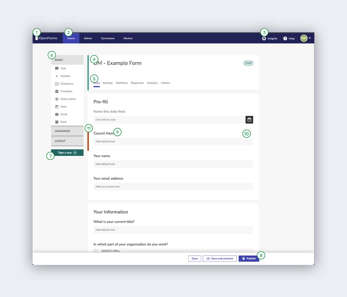
- Product branding
- Product menu
- Account menu
- Form name
- Form menu
- Form fields list
- In-product training
- Form Save/Preview/Publish buttons
- Form field
- Field settings and actions
- Active field indicator
Review of Product Against Design Goals and Existing User Research
- Form field list is narrow and there is not much room given to each field type.
- 2/3rds of the field type options are hidden within expandable sections (i.e. within an accordion). The operation of these sections is not visually indicated, and users may not realise that additional field types are available, and/or understand how they work.
- Field settings and actions are hidden until a user hovers over them. This design choice seems to have been made to reduce visual clutter, however the user may not realise they are available. Field settings and actions are a significant function of the product.
- Field settings and actions, when selected, ‘open up’ above the field. While this keeps the context of which field is being edited for the user, on forms with more than 5 fields (the majority of forms created by users) it is easy for the user to scroll and ‘get lost’, losing their place in the form.
- An ‘active’ field is marked with a thick vertical line in a contrasting colour. This is mostly ideal, however the user may still not notice or interpret the meaning of the line. Making the active field indicator more obvious would help resolve this.
- The form Save/Preview/Publish buttons are at the bottom of the screen. The product is built so this strip always renders properly at the bottom of the user’s screen, however these are important actions for the form builder and should be higher in the page – this would also bring this function inline with other products the user is familiar with. Right alignment is correct and should be retained.
- The form builder includes an in-product training feature which is ideal as it is likely the user has not had much training in the product best practices before using it. This inclusion is undermined due to the placement, which is below the form field list, and could easily be missed by the user.
- Position of product branding at the top left of the screen is ideal and should be retained.
- Product menu and account menu at the top of the screen is ideal. Along the left edge of the screen would also be an ideal placement.
- There is limited button and element feedback on mouse-over and click functions. The user may not understand the intended function of an element due to this. Action element feedback should include at least 3 x state changes e.g. movement, colour change, and physical appearance change (other than colour).
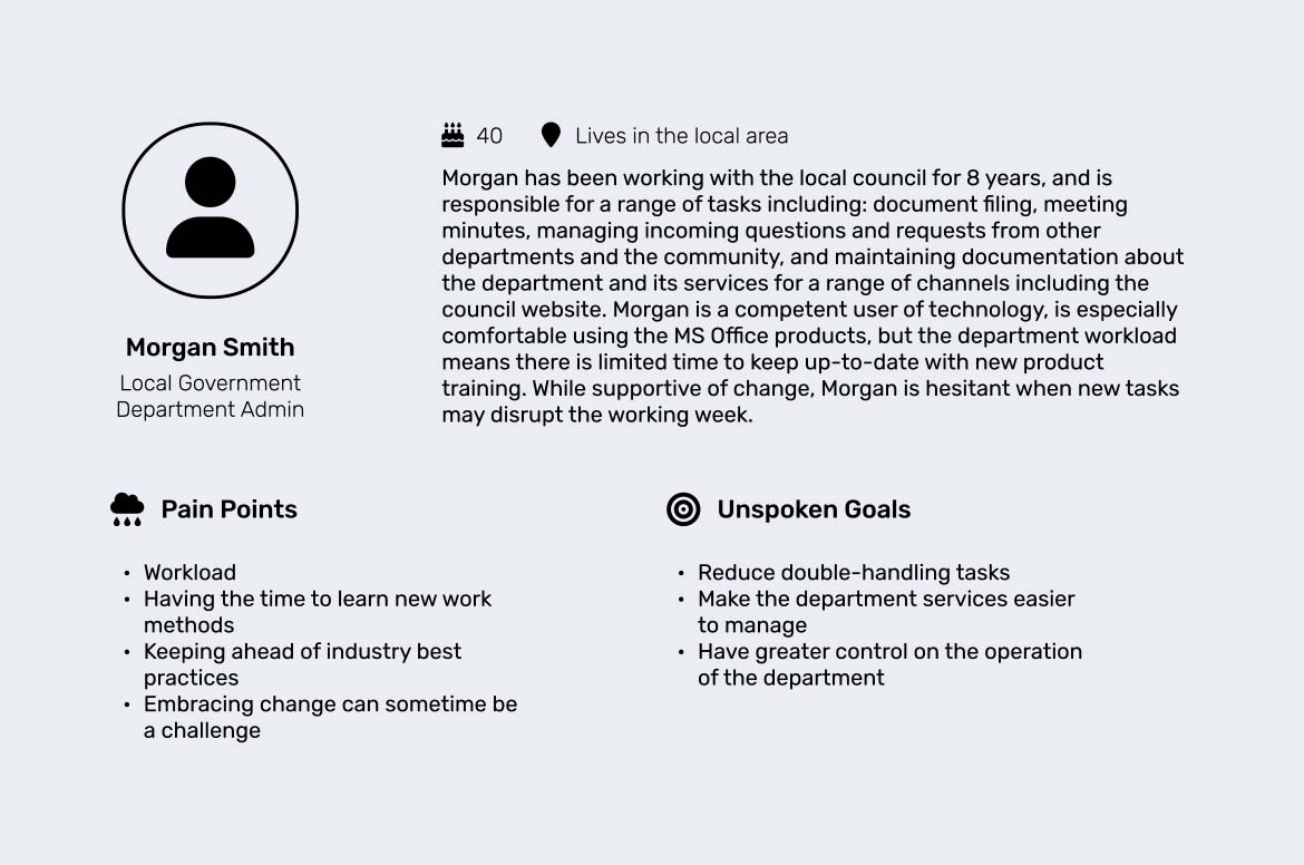
User Persona
The government worker proto-persona
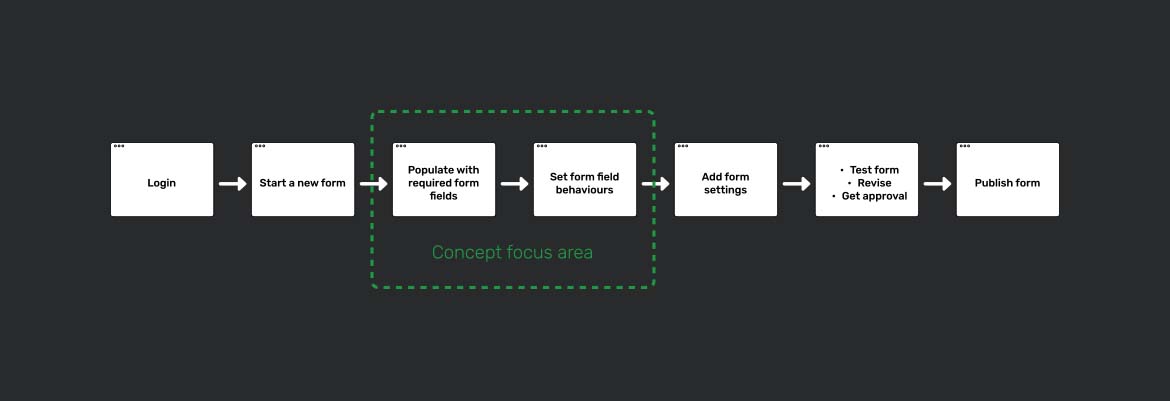
UX Design Storyboard
Overview of the existing high-level form building user flow
Ideation and Sketching

Why this concept was chosen:
- All form field elements are visible on screen
- More space for each form field
- Form field setting option visible at all times
- Form field settings pane loads into the right ‘draw’, tethers to the field being edited, and collapses when not in use
- Left, centre and right columns scroll independently to help users understand where they are in the form, and provide specific spaces for specific actions
- Combined action bar with form title and Save/Preview/Publish buttons to optimise space and keep top level actions centralised and in a location the user would find logical
- Overall product look and feel (e.g. top strip) retained to lower development timeline and costs, and to reduce ‘change shock’ for the user
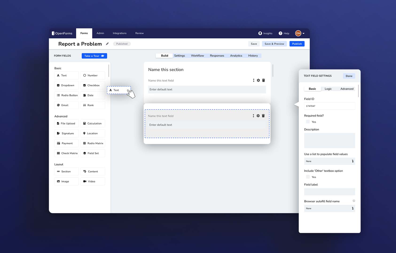
Concept Wireframe + Prototype (high fidelity)
Design Discussion
- All form field options are visible on screen
- Each form field type is given more visual space, and is outlined to indicate the hit area
- Form field setting option visible at all times
- Form field settings pane loads into the right ‘draw’, tethers to the field being edited, and collapses when not in use – this means users can’t scroll and ‘get lost’ in the form
- Left, centre and right columns scroll independently to help users understand where they are in the form – e.g. Form column can be frozen when updating field settings
- Panel and button micro interactions introduced to improve element action intent
- Multiple element feedback indicators when interacting with and moving objects
- Elements from Google Material Design guidelines implemented (layout anatomy, element shadows to add depth) to align with UI best practice
- Combined action bar with form title and Save/Preview/Publish buttons to optimise space and keep top level actions centralised and in a location the user would find logical
- In-product training feature given higher priority in the element stack
- Overall look and feel has been retained to lower development timeline and costs, and to reduce ‘change shock’ for the user